Work we can show you, and numbers we stand behind.
Every client here is named by sector rather than by company, which is what an agency under a confidentiality agreement can honestly publish. The figures are the ones each client agreed we could quote, and we will walk you through any project, including what went wrong.
Every project, start to finish.
Filter by what you need. Each one opens into what was in scope, what it cost us to get right, and the numbers the client agreed to.
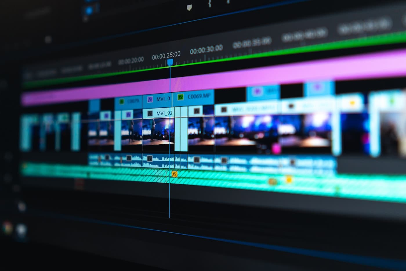
Forty years, told in twelve minutes
A corporate documentary for the national sales conference, cut from a three-day shoot across two plants and the head office, then re-cut for social from the same footage.
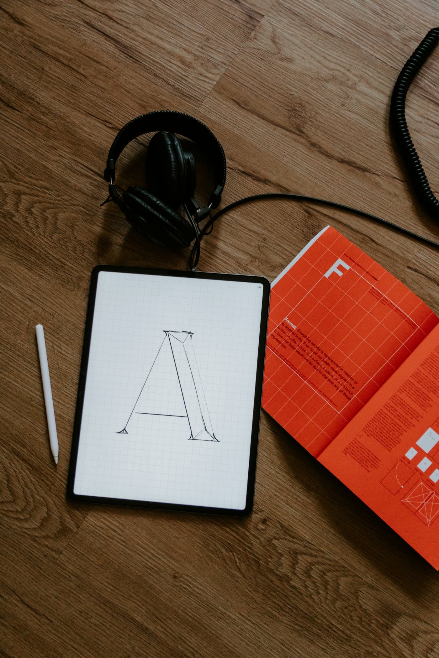
One identity, fourteen printed formats
A full identity with the guideline document behind it, then every sales format drawn from it: brochures, floor plans, site hoardings and the handover folder.
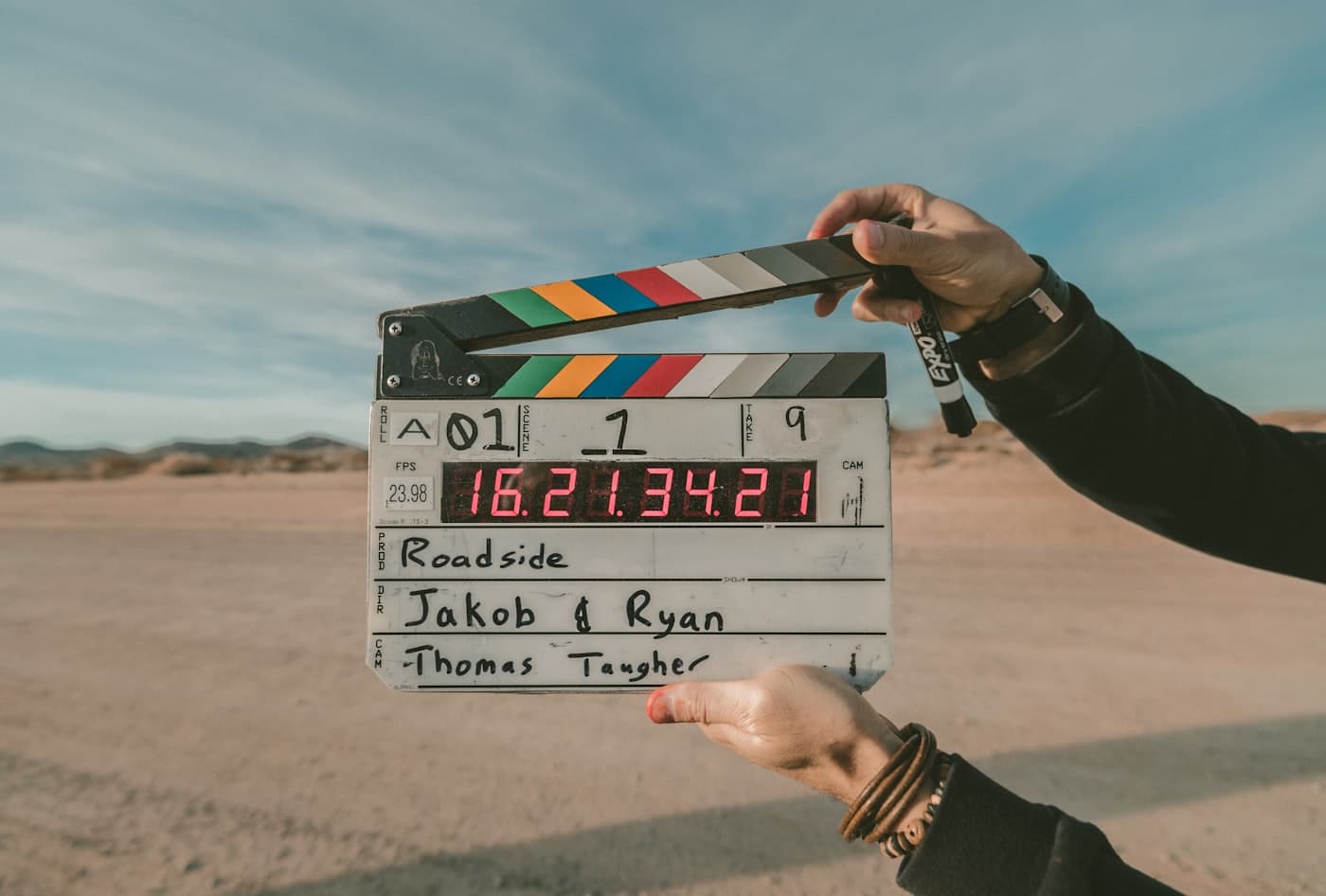
Three districts, one annual report
Field filming and photography across three districts, edited into a donor film and designed into the annual report that used the same frames.
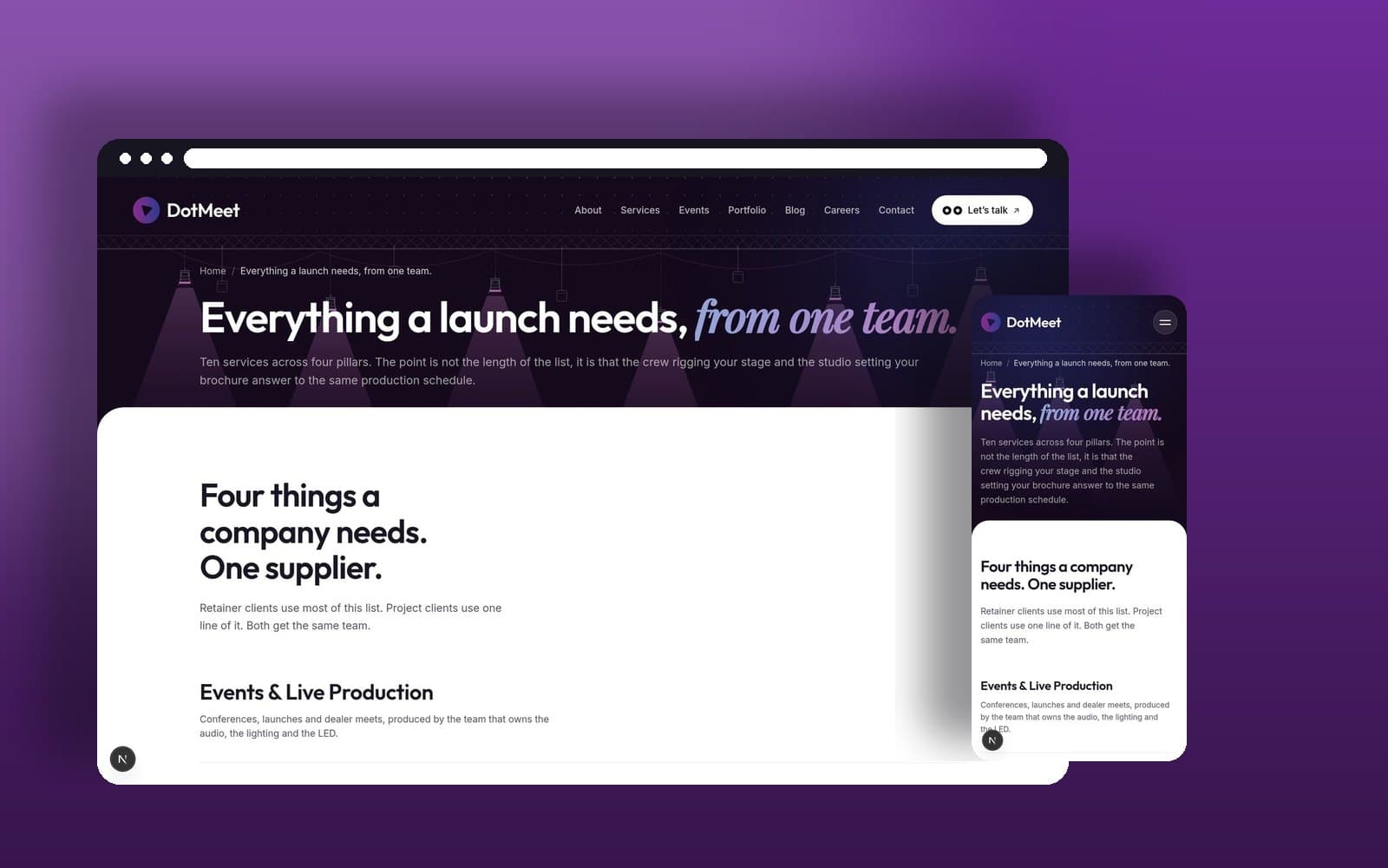
A property site that answers the phone
A twenty two page site for a developer whose enquiries were arriving by phone at eleven at night, built so the site does the first three questions itself.
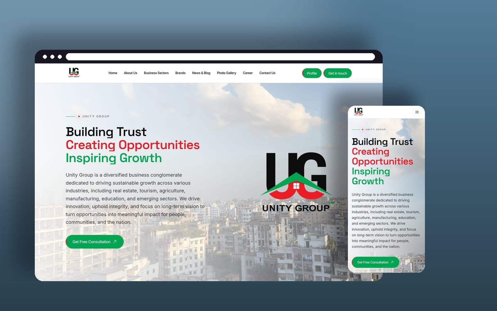
Eight companies, one corporate story
Unity Group operates eight sister concerns across real estate, construction materials, agro, education, tourism and property services. The site had to make one company out of that without flattening what each business actually does.
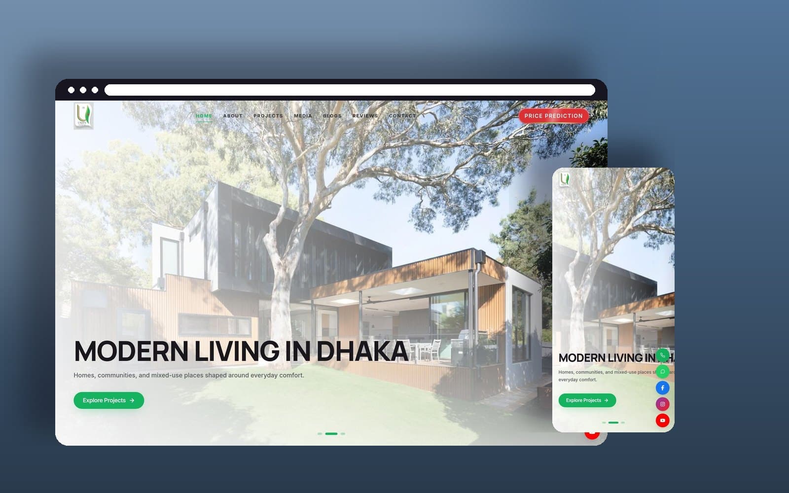
A property site where the projects are the navigation
Unity Landmark develops residential, commercial and mixed-use projects across Dhaka and Cox's Bazar. Somebody looking for a home should reach a building, not a company history, so the projects carry the site.

A month of reels out of one shoot day
Twenty four vertical cuts shot in a single day, so a brand posting three times a week is not booking a crew three times a week.

Nine SKUs that read as one range
A spice range where every pack was designed by whoever was free that month. One structure, one label system, nine products that finally look related.

A label that survives a wet hand
Bathroom products fail in a way a design file cannot show you: the label peels. This one was specified for the shower before it was drawn.

Forty drawings that behave like one language
A bank explaining products to people who find banks unwelcoming. Forty pieces on one grid, one line weight and one palette, so the tenth looks like the first.

Drawing what a photograph could not show
A campaign about household water safety, where photographing real families would have identified them. Illustration was the ethical answer, not the cheap one.

A feed designed as a grid, not a queue
Most feeds are designed one post at a time and look like it. This one was laid out nine at a time, because that is how a profile is actually seen.

Twelve hundred gifts that arrived as approved
Corporate gifting fails at the sample stage, when what turns up is a slightly different colour to what was signed off. This one was specified to Pantone.

An identity that had to work on a truck
Most identities are designed on a screen and applied to a truck afterwards. This one was tested at forty metres before the logo was finished.
Your project is the next one on this page.
Send the brief, or come and see the gear first. Either way you will get questions back before you get a number.
Or call +880-1711-045500. Replied within one working day.