Nine SKUs that read as one range
A spice range where every pack was designed by whoever was free that month. One structure, one label system, nine products that finally look related.
Nine SKUs that read as one range: what we did

9
SKUs
2
Press checks attended
0
Artwork rounds after press
A food manufacturer with nine spice products, every pack designed by whoever was free that month over about six years. Individually most of them were fine. Together they were nine brands.
The shelf is the brief
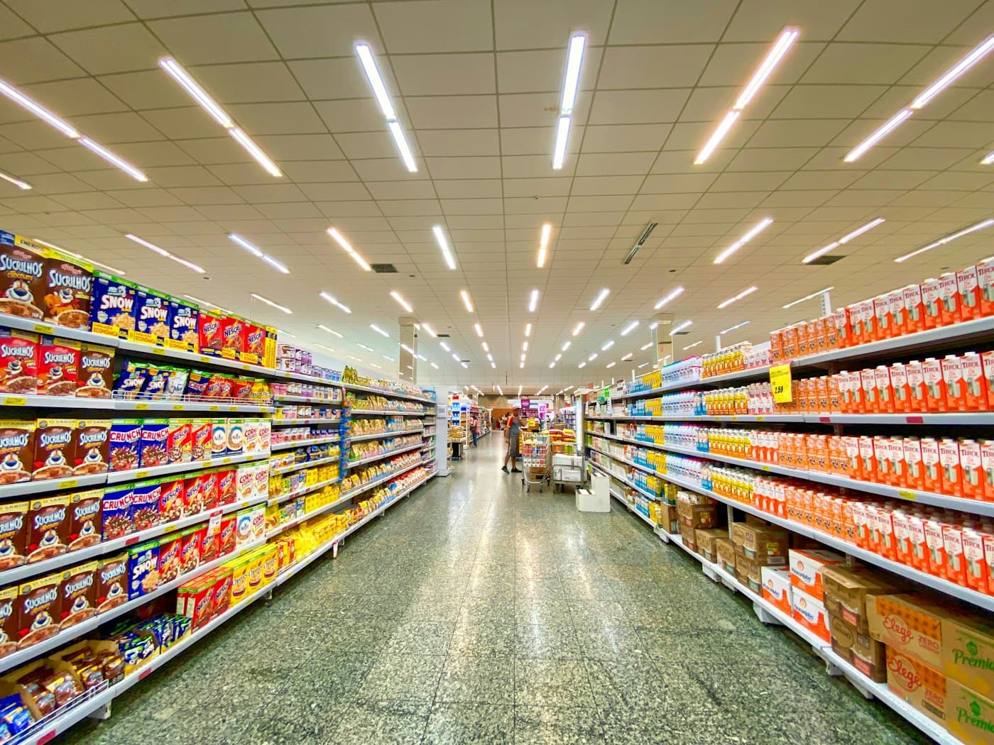
A spice pack is not looked at. It is scanned, at arm's length, on a shelf holding forty competing products, by somebody who has already decided roughly what they want. It has about a second to say two things: which brand this is, and which spice it is.
Nine unrelated designs fail the first test completely. Worse, the client's own products were competing with each other for recognition, so a shopper who liked the turmeric had no way to find the same brand's chilli.
One structure before any artwork
The first decision was physical, not graphic. Three pack sizes across nine products, sharing two dielines instead of the five that had accumulated. That alone cut the tooling, made the cartons stack in a way the outer case actually fits, and gave every pack the same proportions to design into.
Only then did the label system get drawn: a fixed masthead position, a fixed product name position, and a colour band that is the ONLY thing that changes between products.
A shopper should be able to find the range from across the aisle and the specific spice from a metre away. Those are two different design problems and they need two different signals.
The colour band does the work
Nine colours, chosen against each other rather than one at a time, and checked under the lighting a Bangladeshi grocery actually has, which is cool fluorescent rather than the daylight of a design studio. Two of the original choices collapsed into each other under that light and were replaced.
The band is a fixed height and position, so the range reads as a set even when the packs are stacked out of order by whoever filled the shelf.
Print is where designs die
Every file went out print-ready with bleeds, trapping and spot colours specified, not as a PDF with a hopeful note attached. We attended two press checks, which is the part most agencies quote out.
The first check caught a magenta running heavy enough to push two of the nine colour bands toward each other. Fixed on press in twenty minutes. Caught a week later, it would have been a reprint of three SKUs.
What it produced
Nine SKUs on one label system, two dielines instead of five, and zero artwork rounds after the press checks. The range now reads as a range, which is the whole of what the client asked for and the thing that is hardest to show in a design file.
Want this run for you?
Tell us the date and the scale and we will tell you what it takes, including the parts a first quotation usually leaves out.
Or call +880-1711-045500. Replied within one working day.